Brand + Digital Solutions
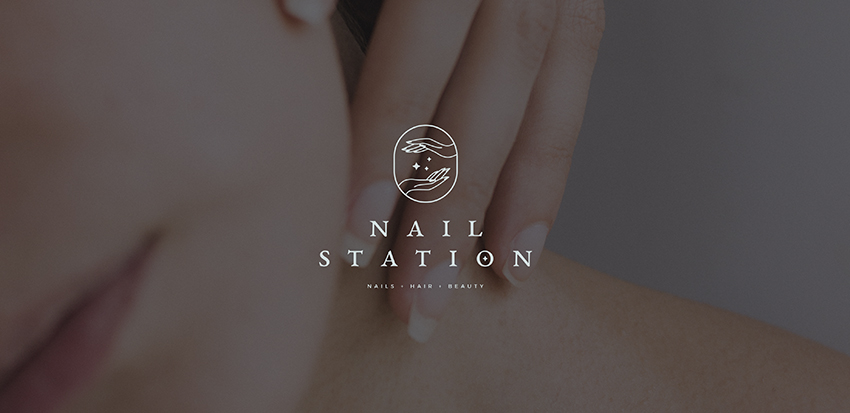
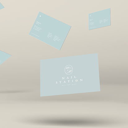


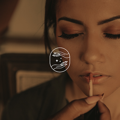
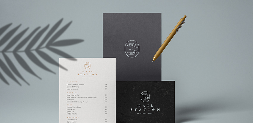
Our goal was to create an attractive and versatile brand for Nail Station, a new nails, hair and beauty salon in Spain.
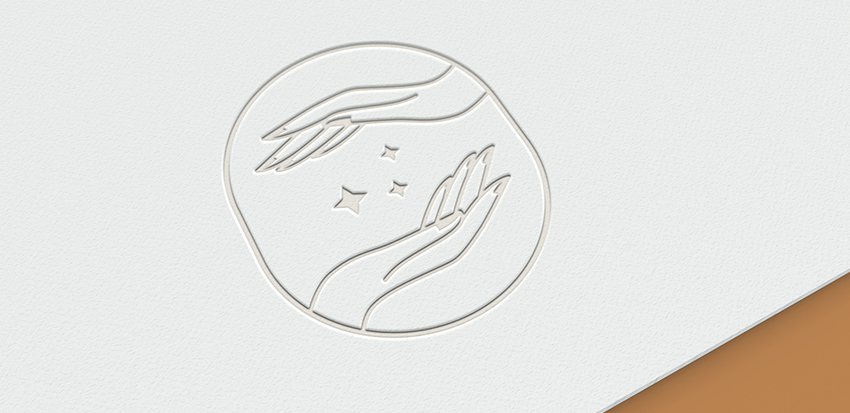
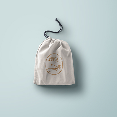
We designed and elegant and feminine logo. The main icon is composed of two elements: The hands, which refer directly to
the manicure services, but also, more subtly, to the concept of ``being in good hands`` that is so important when you go to a salon. The stars in the icon are a small detail that symbolize the harmony and beauty. The chosen typeface has a classic aesthetic, which is modernized by being slightly rounded in the corners. The result is a brand image that conveys both quality, experience, youth and balance.
July 11, 2018